The London Underground is one of the most heavily used metro networks in the world, and the figures that describe it are published by Transport for London rather than by anyone selling advertising on it. This page collects the ones we rely on when planning, each with its source, and is explicit about where our own data stops.
It is a reference page rather than a sales page. What these numbers establish is the scale and the environment; what they cannot establish is how many people saw a particular campaign, which is a different kind of question with its own methods.
The network at a glance
Annual journeys
Transport for London reported 1,216 million London Underground passenger journeys across the 2024/25 financial year, up three per cent on the year before. That is the figure this site rounds to 1.2 billion, and it counts journeys rather than people: one person commuting five days a week contributes roughly ten journeys, not one.
That distinction matters when a journey count is read as an audience. A billion journeys is not a billion individuals, and no figure on this page should be treated as reach. What the number establishes is the volume of the environment, not the size of any campaign's audience.
Stations and lines
The Underground has 272 stations across fare zones 1 to 9 and 11 lines. Two other TfL services — the Elizabeth line and the DLR — are separate networks that share stations and advertising inventory with the Underground at several locations, which is why the station directory on this site covers more locations than the Underground count alone.
Line membership is not a footnote for advertising purposes. A station on six lines behaves differently from a station on one, and platform-level formats can be weighted towards a single line while escalator and ticket hall formats reach everyone passing through.
Platform dwell
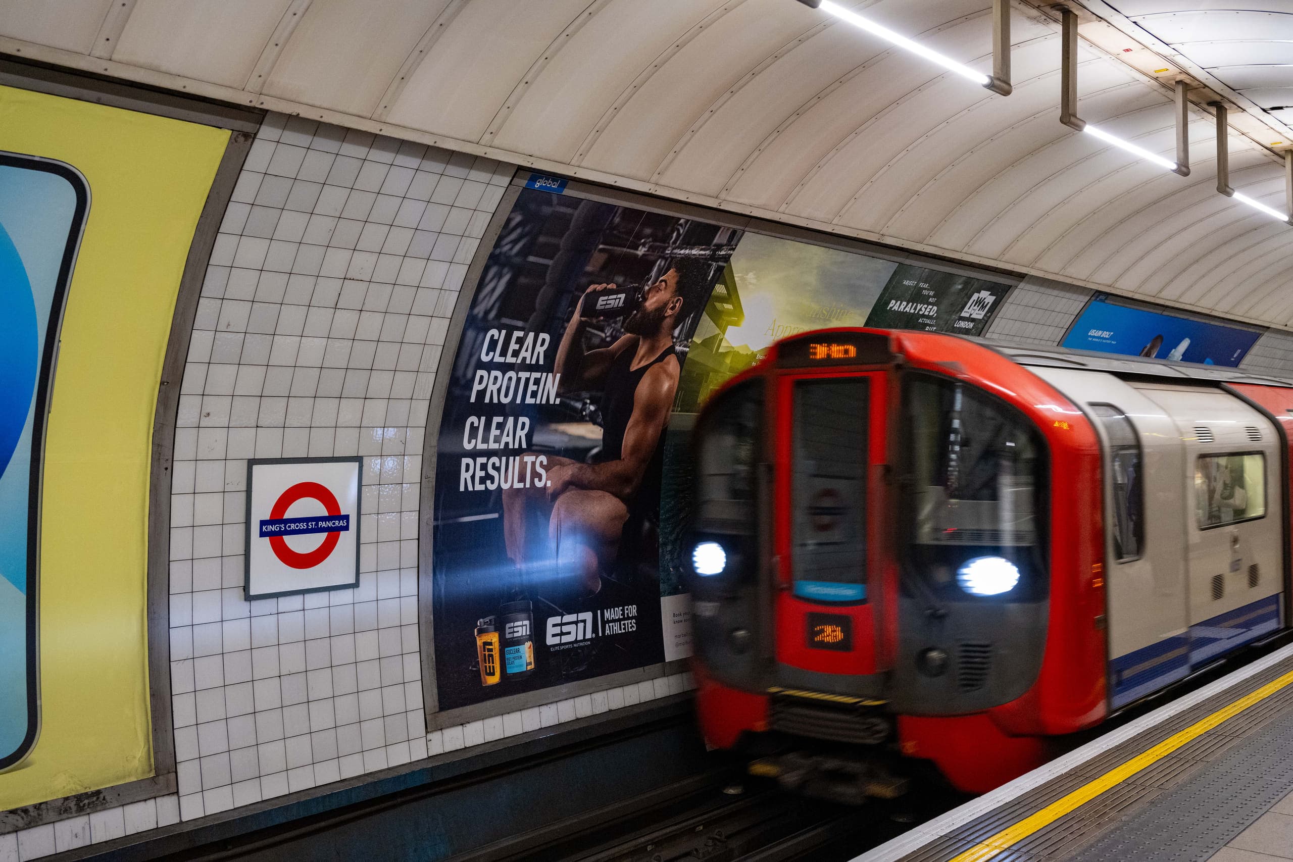
TfL's own London Underground Station Design Idiom gives an average platform dwell of three minutes, and states in the platforms chapter that this allows advertisers to deliver detailed messages. It is the only dwell figure on this site with a primary source behind it, and it describes the platform environment rather than any advertising format.
Station footfall: what we can actually source
This is the point at which our own evidence thins out, and it is worth being direct about it. TfL publishes annual station entry and exit counts. We have not yet integrated that published dataset. The station-level figures currently shown on this site are estimates approximating those counts, and every station page that carries one labels it as an estimate rather than a sourced figure.
- Twenty-four of the written-up stations currently carry an entry and exit estimate.
- Those estimates are planning-grade: good enough to sort a shortlist, not good enough to cite.
- The remaining stations show no figure at all rather than a guess.
- A station without a figure is one we have not sourced. It is not a quiet station, and the absence says nothing about its volume.
For that reason there is no station ranking on this page. A league table built from estimates would read as authoritative precisely because it is tabulated, and it would be the least defensible thing on the site. When the published TfL dataset is integrated, the figures become citable and a comparison becomes worth publishing.
What these figures do and do not tell an advertiser
| The figure supports | The figure does not support |
|---|---|
| The scale of the environment: how heavily the network is used across a year. | How many individual people a campaign reached. Journeys are not people. |
| The structure of the estate: how many stations and lines there are to plan across. | Which of those stations carry a given advertising format. That is inventory, not network data. |
| The nature of the platform environment, including average dwell. | How long anyone looked at a specific panel or screen, or whether they remembered it. |
| A sense of relative station size, from estimates, good enough to shape a shortlist. | A citable ranking of stations by footfall. We do not yet hold sourced figures for that. |
How network scale relates to planning
Network-level numbers set expectations; they do not build plans. A campaign is bought at specific stations, in specific formats, for specific dates, and the useful questions at that point are which stations match the audience and what those stations physically carry. Scale is the reason to consider the medium at all — it is not an argument for any particular site list.
The practical consequence of a network this size is that thin coverage disappears into it. A handful of panels spread across 272 stations is invisible; the same budget concentrated where the audience actually travels is not. That is a planning argument the statistics support directly.
Where each figure comes from
- Journeys: Transport for London quarterly performance report, Q4 2024/25, full-year London Underground passenger journeys.
- Stations, lines and fare zones: Transport for London published network data.
- Platform dwell: Transport for London, London Underground Station Design Idiom, platforms chapter.
- Station entry and exit figures shown elsewhere on this site: estimates approximating TfL's published counts, labelled as estimates wherever they appear.
Every figure on this site carries a confidence level and a source, and the ones that are estimates say so at the point they are shown rather than in a footnote. Where we hold nothing, the page shows nothing.
Sources and references
- Transport for London — network and station data — Station counts, line data and fare zones.